During World War I, Great Britain and the United States started to paint their battleships in irregular black&white stripes, as wanting to break their own structure, with the aim of stunning the enemy and thus avoid the scope of the torpedoes. The only way they found to camouflage themselves in the ocean (or, at least, to confuse) was to paint the vessels with variable geometric motifs that made the size, speed and course of ships impossible to pinpoint.
But...why are we talking about this now? Because the most curious thing about this story is that those camouflage patterns were designed by students of the Royal Academy of Arts in London, and they unavoidably recall the avant-garde of that time. The reflection of the cubist aesthetics at the epicentre of one of the greatest war conflicts in History, together with the simplicity and ingenuity of the measure, make the concept "Razzle-Dazzle" or "Dazzle Camouflage" a phenomenon that we still find fascinating nowadays.
Pre-Dreadnought Battleship USS Nebraska. Unknown author and exact date of photography.
"Dazzle-ships in Drydock at Liverpool", Edward Wadsworth, 1919.
It is not surprising then to find a spontaneous passer-by in front of our May 8 x 3 billboard claiming «This design reminds me of war, destruction and bombing, I don't know what it has, but it makes me feel this way!». Is it due to the little skulls that Antonio Samaniego has camouflaged among other Whatsapp emoticons and Google Maps symbols, unconsciously perceived from a distance?
«I picture the reality in which we live in terms of military occupation. We are occupied the way the French and Norwegians were occupied by the Nazis during World War II, but this time by an army of marketeers. We have, as the occupied nations of Europe had, puppet governments who run the country for the benefit of the occupier. We have, as they did, collaborators. We, like the French and Norwegians at the time, have to protect our families and so are forced on occasion to work with the occupiers to survive. Like the citizens of Nazi-occupied Europe, however, we must also develop strategies for building a resistance movement. We have to reclaim our country from those who occupy it on behalf of their global masters, who have only contempt for those whose territory they now rule.» - Ursula Franklin, educator at University of Toronto, 1998.
As if it were a war of brands, advertising also uses the technique of stunning to enter the heads of consumers. There are for instance concepts like the "Product Placement" in cinema, which can hardly be perceived consciously and appears before your eyes like a fleeting flash, or the "Ambient Marketing" breaking its own support like the English submarines did in 1918. Likewise, subliminal advertising has brought together mass manipulation both for political propaganda and for purchase stimulation from long before the establishment of the consumering system as we know it today, when the phenomenologists Peirce & Jastrow carried out their first experiments in 1884. This is how advertising works: sailing unnoticed in a sea of logos but still reaching its goal, creating a contrast between the subtle and the striking. Secretly outlandish!
Antonio Samaniego uses this antithesis to wink at the advertising pop culture without forgetting its disturbing background, giving rise to numerous little white icons from an abyssal darkness. It consists of a typographic design that produces an evident tension despite its sense of humor, hence the absolutely opposite descriptions I got from the random passers-by when I asked them about their first impressions on the billboard: some declared they had never seen it, even though they were crossing that street every day, others found the billboard flamboyant and eccentric. One person expressed a feeling of «death as destiny», perceiving the arrows, signs and skulls on «a dark background». Others suggested an added explanation in a margin of the poster since «the message is not understood». It seems however that the confusion that makes part of the "Dazzle" concept has been set during the whole month in this street. Why not simply let go of one's own perception?
(English subtitles option available on Youtube)
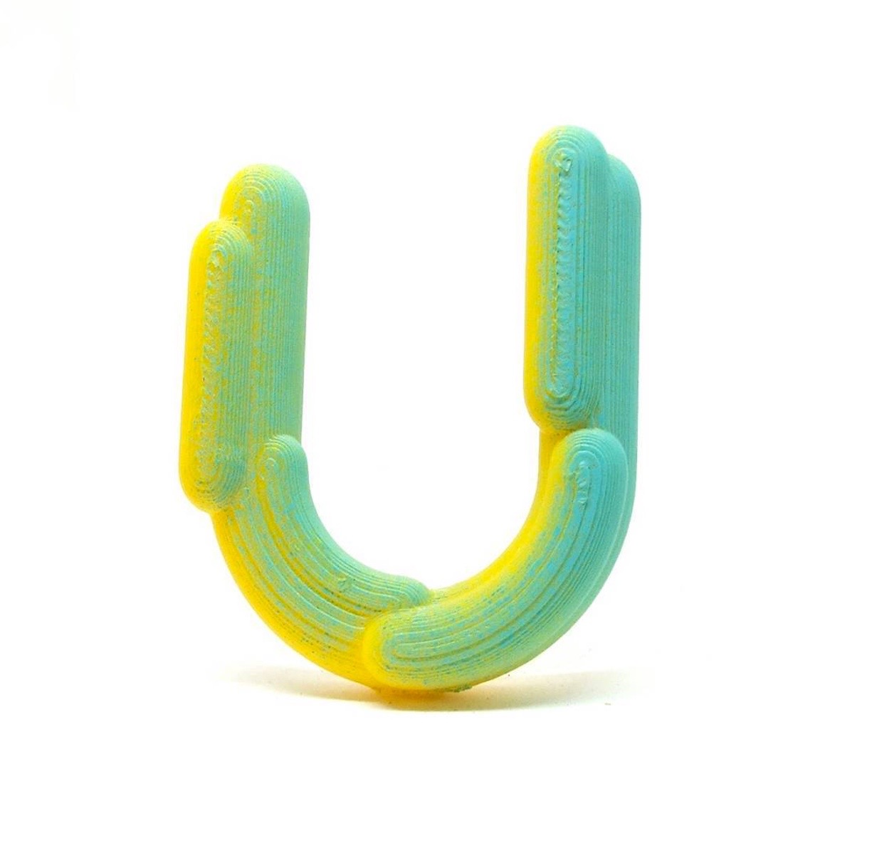
From the very first moment, this poster made me think of graffiti and all the aesthetic research that I've always observed in Antonio, when he plays with elements such as typography or computer graphics. This fusion of concerns is perfectly reflected in the collaborative project "Cuenca 2016", in which he establishes a collaboration with Mr. Trazo and Julián Muz to carry out a series of urban typographic interventions whose documentation can be found on its website. He currently works on a series of 3D printed designs along with his brother Gonzalo Samaniego that I undoubtedly recommend to follow through the instagram @typosama or @samaniego_gonzalo.

One of the murals by Antonio Samaniego and Mr. Trazo for "Cuenca 2016", 2010. Below, example of "36 days of type" by Antonio and Gonzalo Samaniego, 2017.